Tuesday, November 24, 2009

Price Oscillators

Introduction :

The Price Oscillator is an indicator based on the difference between two moving averages, and is expressed as either a percentage or in absolute terms. The number of time periods can vary depending on user preference. For daily data, longer moving averages might be preferred to filter out some of the randomness associated with daily prices. For weekly data, which will have already filtered out some of the randomness, shorter moving averages may be deemed more appropriate. In addition, a moving average of the ensuing plot can be overlaid to act as a trigger line, much like is done with MACD. In our charts and commentary, we will use the abbreviation PPO to refer to the Percentage Price Oscillator and APO to refer to the Absolute Price Oscillator.
Absolute Price Oscillator (APO)

The Absolute Price Oscillator (APO) is calculated by subtracting the longer moving average from the shorter moving average.

For example:


10-period exponential moving average (EMA) minus 30-period EMA

The resulting plot forms an oscillator that fluctuates above and below zero according to the differences in the moving averages. If the shorter moving average is above the longer moving average, then the indicator will be positive. If the shorter moving average is below the longer moving average, then the indicator will be negative.

The Moving Average Convergence Divergence (MACD) indicator calculated as the difference between two exponential moving averages and is essentially equivalent to the APO. StockCharts does not provide an indicator called "APO" in our SharpChart tool - you should use the MACD instead.
Percentage Price Oscillator (PPO)

The Percentage Price Oscillator is found by subtracting the longer moving average from the shorter moving average and then dividing the result by the longer moving average.
For example:


(10-period EMA minus 30-period EMA) divided by the 30-period EMA

This formula displays the difference between the two moving averages as a percentage of the longer moving average.
Absolute versus Percentage :

The Percentage Price Oscillator (PPO) and the Absolute Price Oscillator (APO) generate many of the same signals and have basically the same shape. All centerline crossovers, which represent the shorter moving average crossing above or below the longer moving average, occur at the same time. However, because the PPO is percentage-based, the shape of its lines can differ in subtle but important ways from the shape of the APO's lines. Below is a chart of the NASDAQ Composite that illustrates some of the differences that may crop up.


1. The green circle shows that the PPO formed a lower high in December while the APO formed a higher high.
2. Later in December, the APO continued higher and the PPO began to flatten out. (red arrows)
3. In early January, the PPO recorded a lower low, which was a day earlier than the APO.

There are two main reasons for using the PPO instead of the APO.

With the Percentage Price Oscillator, it is possible to compare Price Oscillator levels from one security to the next. A PPO reading of +5% means that the shorter moving average is 5% higher than the longer moving average. This percentage reading is comparable against another security, regardless of the price of a security. The Percentage Price Oscillator (PPO) for SLB only reached 3% for its highs while that of the NASDAQ Composite rose above 7%.


The Percentage Price Oscillator is a better representation of the two moving averages relative to each other. The difference between the two moving averages is shown in relation to the shorter moving average. This allows for comparisons across time periods, regardless of the price of the stock. With the Absolute Price Oscillator, the higher the price of the stock, the greater the extremes of the oscillator. With the Percentage Price Oscillator, a comparison of Amazon over time is possible regardless of whether the stock is at 10 or 100.


PPO-Histogram :

Because the Price Oscillator and MACD are so similar, the concept of the MACD-Histogram has been applied to the PPO. The PPO-Histogram shows the difference between the PPO and the 9-day EMA of the PPO. The plot is presented as a histogram so that centerline crossovers and divergences are easily identifiable. The same principles that apply to the MACD-Histogram are also applicable to the PPO-Histogram.

A centerline crossover for the PPO-Histogram is the same as a moving average crossover for the PPO. If the value of the PPO is larger than the value of its 9-day EMA, then the value on the PPO-Histogram will be positive. Conversely, if the value of the PPO is less than its 9-day EMA, then the value of the PPO-Histogram will be negative.


Further increases or decreases in the gap between the PPO and its 9-day EMA will be reflected in the PPO-Histogram. Sharp increases in the PPO-Histogram indicate that the PPO is rising faster than its 9-day EMA – bullish momentum is strengthening. Sharp declines in the PPO-Histogram indicate that the PPO is falling faster than its moving average – bearish momentum is increasing.

PPO and SharpCharts :


SharpCharts allows users to chart the Percentage Price Oscillator by selecting "Price Oscillator (PPO)" from any "Indicators" dropdown. The standard settings of "12,26,9" are automatically added to the "Parameters" box and can be changed to any combination of integer numbers. The first parameter is the number of periods to use for the first EMA in the calculation. The second parameter is the number of periods to use for the second (typically longer) EMA. The last parameter is the number of periods to use for the signal line.

For more on the interpretation of this oscillator and its signals, see our articles about oscillators and MACD.

Friday, November 20, 2009

Parabolic SAR

Introduction :

Developed by Welles Wilder, creator of RSI and DMI, the Parabolic SAR sets trailing price stops for long or short positions. Also referred to as the stop-and-reversal indicator (SAR stands for "stop and reversal"), Parabolic SAR is more popular for setting stops than for establishing direction or trend. Wilder recommended establishing the trend first, and then trading with Parabolic SAR in the direction of the trend. If the trend is up, buy when the indicator moves below the price. If the trend is down, sell when the indicator moves above the price.
Calculation :

The formula is quite complex and beyond the scope of this definition, but interpretation is relatively straightforward. The dotted lines below the price establish the trailing stop for a long position and the lines above establish the trailing stop for a short position. At the beginning of the move, the Parabolic SAR will provide a greater cushion between the price and the trailing stop. As the move gets underway, the distance between the price and the indicator will shrink, thus making for a tighter stop-loss as the price moves in a favorable direction.

There are two variables: the step and the maximum step. The higher the step is set, the more sensitive the indicator will be to price changes. If the step is set too high, the indicator will fluctuate above and below the price too often, making interpretation difficult. The maximum step controls the adjustment of the SAR as the price moves. The lower the maximum step is set, the further the trailing stop will be from the price. Wilder recommends setting the step at .02 and the maximum step at .20.


The chart for Microsoft (MSFT) shows how the Parabolic SAR can catch most trends and allow the trader to profit from the buy/sell signals. The default settings that Wilder recommends diminishes distracting fluctuations, but does not make the indicator immune to whipsaws (black arrow). A proper interpretation of this indicator would suggest that a trader should close long positions when the price falls below the SAR (red arrow) and close short positions when the price rises above the SAR (green arrow).

The Parabolic SAR works best during strong trending periods, which Wilder himself estimates occur roughly 30% of the time. Therefore, the user may first want to determine if the market is trending by using other indicators such as Wilder's ADX line.

Parabolic SAR and SharpCharts :


With SharpCharts, the Parabolic SAR can be charting using any specified step (first parameter) and maximum step (second parameter). Wilder's recommended parameters are used as default.

Thursday, November 19, 2009

On Balance Volume (OBV)

Introduction :

Joe Granville introduced the On Balance Volume (OBV) indicator in his 1963 book, Granville's New Key to Stock Market Profits. This was one of the first and most popular indicators to measure positive and negative volume flow. The concept behind the indicator: volume precedes price. OBV is a simple indicator that adds a period's volume when the close is up and subtracts the period's volume when the close is down. A cumulative total of the volume additions and subtractions forms the OBV line. This line can then be compared with the price chart of the underlying security to look for divergences or confirmation.
Calculation:

As stated above, OBV is calculated by adding the day's volume to a running cumulative total when the security's price closes up, and subtracts the volume when it closes down.

For example, if today the closing price is greater than yesterday's closing price, then the new OBV = Yesterday's OBV + Today's Volume.

If today the closing price is less than yesterday's closing price, then the new OBV = Yesterday's OBV - Today's Volume.

If today the closing price is equal to yesterday's closing price, then the new OBV = Yesterday's OBV.
Use :

The idea behind the OBV indicator is that changes in the OBV will precede price changes. A rising volume can indicate the presence of smart money flowing into a security. Then once the public follows suit, the security's price will likewise rise.

Like other indicators, the OBV indicator will take a direction. A rising (bullish) OBV line indicates that the volume is heavier on up days. If the price is likewise rising, then the OBV can serve as a confirmation of the price uptrend. In such a case, the rising price is the result of an increased demand for the security, which is a requirement of a healthy uptrend.

However, if prices are moving higher while the volume line is dropping, a negative divergence is present. This divergence suggests that the uptrend is not healthy and should be taken as a warning signal that the trend will not persist.

The numerical value of OBV is not important, but rather the direction of the line. A user should concentrate on the OBV trend and its relationship with the security's price.
Example :


This chart shows how the OBV line can be used as confirmation of a price trend. The peak in September was followed by lower price movements that corresponded with volume spikes, thus implying that the downtrend was going to continue.
OBV and SharpCharts :


Using SharpCharts, the On Balance Volume can be charted as an indicator. The optional parameter edits the amount of periods for the moving average overlay.

Tuesday, November 17, 2009

Momentum Oscillators

Introduction to Technical Indicators and Oscillators :
Introduction :

This article is designed to introduce the concept of technical indicators and explain how to use them in your analysis. We will shed light on the difference between leading and lagging indicators, as well as look into the benefits and drawbacks. Many, if not most, popular indicators are shown as oscillators. With this in mind, we will also show how to read oscillators and explain how signals are derived. Later we will turn our focus to specific technical indicators and provide examples of signals in action.

What Is a Technical Indicator?

A technical indicator is a series of data points that are derived by applying a formula to the price data of a security. Price data includes any combination of the open, high, low or close over a period of time. Some indicators may use only the closing prices, while others incorporate volume and open interest into their formulas. The price data is entered into the formula and a data point is produced.
For example, the average of 3 closing prices is one data point ( (41+43+43) / 3 = 42.33 ). However, one data point does not offer much information and does not an indicator make. A series of data points over a period of time is required to create valid reference points to enable analysis. By creating a time series of data points, a comparison can be made between present and past levels. For analysis purposes, technical indicators are usually shown in a graphical form above or below a security's price chart. Once shown in graphical form, an indicator can then be compared with the corresponding price chart of the security. Sometimes indicators are plotted on top of the price plot for a more direct comparison.
What Does a Technical Indicator Offer?

A technical indicator offers a different perspective from which to analyze the price action. Some, such as moving averages, are derived from simple formulas and the mechanics are relatively easy to understand. Others, such as Stochastics, have complex formulas and require more study to fully understand and appreciate. Regardless of the complexity of the formula, technical indicators can provide unique perspective on the strength and direction of the underlying price action.

A simple moving average is an indicator that calculates the average price of a security over a specified number of periods. If a security is exceptionally volatile, then a moving average will help to smooth the data. A moving average filters out random noise and offers a smoother perspective of the price action. Veritas (VRTS) displays a lot of volatility and an analyst may have difficulty discerning a trend. By applying a 10-day simple moving average to the price action, random fluctuations are smoothed to make it easier to identify a trend.


Why Use Indicators?

Indicators serve three broad functions: to alert, to confirm and to predict.
An indicator can act as an alert to study price action a little more closely. If momentum is waning, it may be a signal to watch for a break of support. Or, if there is a large positive divergence building, it may serve as an alert to watch for a resistance breakout. Indicators can be used to confirm other technical analysis tools. If there is a breakout on the price chart, a corresponding moving average crossover could serve to confirm the breakout. Or, if a stock breaks support, a corresponding low in the On-Balance-Volume (OBV) could serve to confirm the weakness. Some investors and traders use indicators to predict the direction of future prices.

Tips for Using Indicators :

Indicators indicate. This may sound straightforward, but sometimes traders ignore the price action of a security and focus solely on an indicator. Indicators filter price action with formulas. As such, they are derivatives and not direct reflections of the price action. This should be taken into consideration when applying analysis. Any analysis of an indicator should be taken with the price action in mind. What is the indicator saying about the price action of a security? Is the price action getting stronger? Weaker?

Even though it may be obvious when indicators generate buy and sell signals, the signals should be taken in context with other technical analysis tools. An indicator may flash a buy signal, but if the chart pattern shows a descending triangle with a series of declining peaks, it may be a false signal.

On the Rambus (RMBS) chart, MACD improved from November to March, forming a positive divergence. All the earmarks of a MACD buying opportunity were present, but the stock failed to break above the resistance and exceed its previous reaction high. This non-confirmation from the stock should have served as a warning sign against a long position. For the record, a sell signal occurred when the stock broke support from the descending triangle in March-01.


As always in technical analysis, learning how to read indicators is more of an art than a science. The same indicator may exhibit different behavioral patterns when applied to different stocks. Indicators that work well for IBM might not work the same for Delta Airlines. Through careful study and analysis, expertise with the various indicators will develop over time. As this expertise develops, certain nuances as well as favorite setups will become clear.

There are hundreds of indicators in use today, with new indicators being created every week. Technical analysis software programs come with dozens of indicators built in, and even allow users to create their own. Given the amount of hype that is associated with indicators, choosing an indicator to follow can be a daunting task. Even with the introduction of hundreds of new indicators, only a select few really offer a different perspective and are worthy of attention. Strangely enough, the indicators that usually merit the most attention are those that have been around the longest time and have stood the test of time.

When choosing an indicator to use for analysis, choose carefully and moderately. Attempts to cover more than five indicators are usually futile. It is best to focus on two or three indicators and learn their intricacies inside and out. Try to choose indicators that complement each other, instead of those that move in unison and generate the same signals. For example, it would be redundant to use two indicators that are good for showing overbought and oversold levels, such as Stochastics and RSI. Both of these indicators measure momentum and both have overbought/oversold levels.
Leading Indicators:

As their name implies, leading indicators are designed to lead price movements. Most represent a form of price momentum over a fixed look-back period, which is the number of periods used to calculate the indicator. For example, a 20-day Stochastic Oscillator would use the past 20 days of price action (about a month) in its calculation. All prior price action would be ignored. Some of the more popular leading indicators include Commodity Channel Index (CCI), Momentum, Relative Strength Index (RSI), Stochastic Oscillator and Williams %R.
Momentum Oscillators :

Many leading indicators come in the form of momentum oscillators. Generally speaking, momentum measures the rate-of-change of a security's price. As the price of a security rises, price momentum increases. The faster the security rises (the greater the period-over-period price change), the larger the increase in momentum. Once this rise begins to slow, momentum will also slow. As a security begins to trade flat, momentum starts to actually decline from previous high levels. However, declining momentum in the face of sideways trading is not always a bearish signal. It simply means that momentum is returning to a more median level.

RSI


Momentum indicators employ various formulas to measure price changes. RSI (a momentum indicator) compares the average price change of the advancing periods with the average change of the declining periods. On the IBM chart, RSI advanced from October to the end of November. During this period, the stock advanced from the upper 60s to the low 80s. When the stock traded sideways in the first half of December, RSI dropped rather sharply (blue lines). This consolidation in the stock was quite normal and actually healthy. From these lofty levels (near 70), flat price action would be expected to cause a a decline in RSI (and momentum). If RSI were trading around 50 and the stock began to trade flat, the indicator would not be expected to decline. The green lines on the chart mark a period of sideways trading in the stock and in RSI. RSI started from a relatively median level, around 50. The subsequent flat price action in the stock also produced relatively flat price action in the indicator and it remains around 50.

Benefits and Drawbacks of Leading Indicators There are clearly many benefits to using leading indicators. Early signaling for entry and exit is the main benefit. Leading indicators generate more signals and allow more opportunities to trade. Early signals can also act to forewarn against a potential strength or weakness. Because they generate more signals, leading indicators are best used in trading markets. These indicators can be used in trending markets, but usually with the major trend, not against it. In a market trending up, the best use is to help identify oversold conditions for buying opportunities. In a market that is trending down, leading indicators can help identify overbought situations for selling opportunities.

With early signals comes the prospect of higher returns and with higher returns comes the reality of greater risk. More signals and earlier signals mean that the chances of false signals and whipsaws increase. False signals will increase the potential for losses. Whipsaws can generate commissions that can eat away profits and test trading stamina.
Lagging Indicators :

As their name implies, lagging indicators follow the price action and are commonly referred to as trend-following indicators. Rarely, if ever, will these indicators lead the price of a security. Trend-following indicators work best when markets or securities develop strong trends. They are designed to get traders in and keep them in as long as the trend is intact. As such, these indicators are not effective in trading or sideways markets. If used in trading markets, trend-following indicators will likely lead to many false signals and whipsaws. Some popular trend-following indicators include moving averages (exponential, simple, weighted, variable) and MACD.


The chart above shows the S&P 500 ($SPX) with the 20-day simple moving average and the 100-day simple moving average. Using a moving average crossover to generate the signals, there were seven signals over the two years covered in the chart. Over these two years, the system would have been enormously profitable. This is due to the strong trends that developed from Oct-97 to Aug-98 and from Nov-98 to Aug-99. However, notice that as soon as the index starts to move sideways in a trading range, the whipsaws begin. The signals in Nov-97 (sell), Aug-99 (sell) and Sept-99 (buy) were reversed in a matter of days. Had these moving averages been longer (50- and 200-day moving averages), there would have been fewer whipsaws. Had these moving average been shorter (10 and 50-day moving average), there would have been more whipsaws, more signals, and earlier signals.
Benefits and Drawbacks of Lagging Indicators:

One of the main benefits of trend-following indicators is the ability to catch a move and remain in a move. Provided the market or security in question develops a sustained move, trend-following indicators can be enormously profitable and easy to use. The longer the trend, the fewer the signals and less trading involved.

The benefits of trend-following indicators are lost when a security moves in a trading range. In the S&P 500 example, the index appears to have been range-bound at least 50% of the time. Even though the index trended higher from 1982 to 1999, there have also been large periods of sideways movement. From 1964 to 1980, the index traded within a large range bound by 85 and 110.
Another drawback of trend-following indicators is that signals tend to be late. By the time a moving average crossover occurs, a significant portion of the move has already occurred. The Nov-98 buy signal occurred at 1130, about 19% above the Oct-98 low of 950. Late entry and exit points can skew the risk/reward ratio.
The Challenge of Indicators :

For technical indicators, there is a trade-off between sensitivity and consistency. In an ideal world, we want an indicator that is sensitive to price movements, gives early signals and has few false signals (whipsaws). If we increase the sensitivity by reducing the number of periods, an indicator will provide early signals, but the number of false signals will increase. If we decrease sensitivity by increasing the number of periods, then the number of false signals will decrease, but the signals will lag and and this will skew the reward-to-risk ratio.

The longer a moving average is, the slower it will react and fewer signals will be generated. As the moving average is shortened, it becomes faster and more volatile, increasing the number of false signals. The same holds true for the various momentum indicators. A 14 period RSI will generate fewer signals than a 5 period RSI. The 5 period RSI will be much more sensitive and have more overbought and oversold readings. It is up to each investor to select a time frame that suits his or her trading style and objectives.
Oscillator Types :

An oscillator is an indicator that fluctuates above and below a centerline or between set levels as its value changes over time. Oscillators can remain at extreme levels (overbought or oversold) for extended periods, but they cannot trend for a sustained period. In contrast, a security or a cumulative indicator like On-Balance-Volume (OBV) can trend as it continually increases or decreases in value over a sustained period of time.


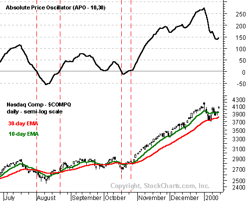
As the indicator comparison chart shows, oscillator movements are more confined and sustained movements (trends) are limited, no matter how long the time period. Over the two year period, Moving Average Convergence Divergence (MACD) fluctuated above and below zero, touching the zero line about 18 times. Also notice that each time MACD surpassed +80 the indicator pulled back. Even though MACD does not have an upper or lower limit on its range of values, its movements appear confined. OBV, on the other hand, began an uptrend in March 2003 and advanced steadily for the next year. Its movements are not confined and long-term trends can develop.

There are many different types of oscillators and some belong to more than one category. The breakdown of oscillator types begins with two types: centered oscillators which fluctuate above and below a center point or line, and banded oscillators which fluctuate between overbought and oversold extremes. Generally, centered oscillators are best suited for analyzing the direction of price momentum, while banded oscillators are best suited for identifying overbought and oversold levels.
Centered Oscillators :

Centered oscillators fluctuate above and below a central point or line. These oscillators are good for identifying the strength or weakness, or direction, of momentum behind a security's move. In its purest form, momentum is positive (bullish) when a centered oscillator is trading above its center line and negative (bearish) when the oscillator is trading below its center line.

MACD is an example of a centered oscillator that fluctuates above and below zero. MACD is the difference between the 12-day EMA and 26-day EMA of a security. The further one moving average moves away from the other, the higher the reading. Even though there is no range limit to MACD, extremely large differences between the two moving averages are unlikely to last for long.

MACD :

MACD is unique in that it has lagging elements as well as leading elements. Moving averages are lagging indicators and would be classified as trend-following or lagging elements. However, by taking the differences in the moving averages, MACD incorporates aspects of momentum or leading elements. The difference between the moving averages represents the rate of change. By measuring the rate-of-change, MACD becomes a leading indicator, but still with a bit of lag. With the integration of both moving averages and rate-of-change, MACD has forged a unique spot among oscillators as both a lagging and a leading indicator.
ROC :

Rate-of-change (ROC) is a centered oscillator that also fluctuates above and below zero. As its name implies, ROC measures the percentage price change over a given time period. For example: 20 day ROC would measure the percentage price change over the last 20 days. The bigger the difference between the current price and the price 20 days ago, the higher the value of the ROC Oscillator. When the indicator is above 0, the percentage price change is positive (bullish). When the indicator is below 0, the percentage price change is negative (bearish).


As with MACD, ROC is not bound by upper or lower limits. This is typical of most centered oscillators and can make it difficult to spot overbought and oversold conditions. This ROC chart indicates that readings above +20% and below -20% represent extremes and are unlikely to last for an extended period of time. However, the only way to gauge that +20% and -20% are extreme readings is from past observations. Also, +20% and -20% represent extremes for this particular security and may not be the same for other securities. Banded oscillators offer a better alternative to gauge extreme price levels.
Banded Oscillators :

Banded oscillators fluctuate above and below two bands that signify extreme price levels. The lower band represents oversold readings and the upper band represents overbought readings. These set bands are based on the oscillator and change little from security to security, allowing the users to easily identify overbought and oversold conditions. The Relative Strength Index (RSI) and the Stochastic Oscillator are two examples of banded oscillators. (Note: The formulas and rationale behind RSI and the Stochastic Oscillator are more complicated than those for MACD and ROC. As such, calculations are addressed in separate articles.)

Stochastics/RSI :


For RSI, the bands for overbought and oversold are usually set at 70 and 30 respectively. A reading greater than 70 would be considered overbought and a reading below 30 would be considered oversold. For the Stochastic Oscillator, a reading above 80 is overbought and a reading below 20 oversold. Even though these are the recommended band settings, certain securities may not adhere to these ranges and might require more fine-tuning. Making adjustments to the bands is usually a judgment call that will reflect a trader's preferences and the volatility of the security.

Many, but not all, banded oscillators fluctuate within set upper and lower limits. The Relative Strength Index (RSI) is range-bound by 0 and 100 and will never go higher than 100 nor lower than zero. The Stochastic Oscillator is another oscillator with a set range and is bound by 100 and 0 as well. However, the Commodity Channel Index (CCI) is an example of a banded oscillator that is not range bound.

CCI


Pros and Cons of Centered and Banded Oscillators :

Centered oscillators are best used to identify the underlying strength or direction of momentum behind a move. Broadly speaking, readings above the center point indicate bullish momentum and readings below the center point indicate bearish momentum. The biggest difference between centered oscillators and banded oscillators is the latter's ability to identify extreme readings. While it is possible to identify extreme readings with centered oscillators, they are not ideal for this purpose. Banded oscillators are best suited to identify overbought and oversold conditions.
Oscillator Signals :

Oscillators generate buy and sell signals in various ways. Some signals are geared towards early entry, while others appear after the trend has begun. In addition to buy and sell signals, oscillators can signal that something is amiss with the current trend or that the current trend is about to change. Even though oscillators can generate their own signals, it is important to use these signals in conjunction with other aspects of technical analysis. Most oscillators are momentum indicators and only reflect one characteristic of a security's price action. Volume, price patterns and support/resistance levels should also be taken into consideration.
Positive and Negative Divergences :

Divergence is a key concept behind many signals for oscillators as well as other indicators. Divergences can serve as a warning that the trend is about to change or set up a buy or sell signal. There are two types of divergences: positive and negative. In its most basic form, a positive divergence occurs when the indicator advances and the underlying security declines. A negative divergence occurs when an indicator declines and the underlying security advances.


On the Merrill Lynch (MER) chart, MACD formed a positive divergence in late October. While MER was trading below its previous reaction low, MACD had yet to penetrate its previous low (green arrows). However, MACD had not turned up and the positive divergence was still just a possibility. When MACD turned up and traded above its 9-day EMA, a positive divergence was confirmed. At this point, other signals came together to create a buy signal. Not only had the stock reached support and gapped up, but there was also a MACD positive divergence and a MACD bullish crossover. (Note: The thick line is the MACD and the thin line is the 9-day EMA of the MACD, which acts as a trigger line. A bullish crossover occurs when MACD moves above its 9-day EMA and a bearish crossover occurs when MACD moves below its 9-day EMA.) After these MACD signals, the stock gapped up the very next day on a huge increase in volume.


On the IBM chart, the ROC Oscillator formed a negative divergence prior to the decline that began in January. When IBM recorded a high in mid January, the ROC Oscillator failed to surpass its previous high. The stock then began to decline and the ROC Oscillator turned lower as well, thus completing the lower high and the negative divergence. As there was little else to go on at the time, this negative divergence should have been taken as a warning signal. However, when the ROC Oscillator continued to deteriorate and broke below 0 (centerline), it was clear that the stock was weak and vulnerable to a further decline.
Overbought and Oversold Extremes:

Banded oscillators are designed to identify overbought and oversold extremes. Since these oscillators fluctuate between extremes, they can be difficult to use in trending markets. Banded oscillators are best used in trading ranges or with securities that are not trending. In a strong trend, users may see many signals that are not really valid. If a stock is in a strong uptrend, buying on oversold conditions will work much better than selling on overbought conditions.

In a strong trend, oscillator signals against the direction of the underlying trend are less robust than those with the trend. The trend is your friend and can be dangerous to fight it. Even though securities develop trends, they also fluctuate within those trends. If a stock is in a strong uptrend, buying when oscillators reach oversold conditions (and near support tests) will work much better than selling on overbought conditions. During a strong downtrend, selling when oscillators reach overbought conditions would work much better. If the path of least resistance is up (down), then acting on only bullish (bearish) signals would be in harmony with the trend. Attempts to trade against the trend carry added risk.

When the trend is strong, banded oscillators can remain near overbought or oversold levels for extended periods. An overbought condition does not indicate that it is time to sell, nor does an oversold condition indicate that it is time to buy. In a strong uptrend, an oscillator can reach an overbought condition and remain so as the underlying security continues to advance. A negative divergence may form, but a bearish signal against the uptrend should be considered suspect. In a strong downtrend, an oscillator can reach an oversold condition and remain so as the underlying security continues to decline. Similarly, a positive divergence may form, but a bullish signal against the downtrend should be considered suspect. This does not mean counter-trend signals won't work, but they should be viewed in proper context and considered with other aspects of technical analysis.

The first step in using banded oscillators is to identify the upper and lower bands that mark the extremities. For RSI, anything below 30 and above 70 represents an extremity. For the Stochastic Oscillator, anything below 20 and above 80 represents an extremity. We know that when RSI is below 30 or the Stochastic Oscillator is below 20, an oversold condition exists. By that same token, when RSI is above 70 and the Stochastic Oscillator is above 80, an overbought condition exists. Identification of an overbought or oversold condition should serve as an alert to monitor other technical aspects (price pattern, trend, support, resistance, candlesticks, volume or other indicators) with extra vigilance.
The simplest method to generate signals is to note when the upper and lower bands are crossed. If a security is overbought (above 70 for RSI and 80 for the Stochastic Oscillator) and moves back down below the upper band, then a sell signal is generated. If a security is oversold (below 30 for RSI and 20 for the Stochastic Oscillator) and moves back above the lower band, then a buy signal is generated. Keep in mind that these are the simplest methods.
Simple signals can also be combined with divergences and moving average crossovers to create more robust signals. Once a stock becomes oversold, traders may look for a positive divergence to develop in the RSI and then a cross above 30. With the Stochastic Oscillator overbought, traders may look for a negative divergence and combine that with a moving average crossover and a break below 80 to generate a signal. (Note: The Stochastic Oscillator is usually plotted with a 3-day simple moving average that acts as the trigger line. When the Stochastic Oscillator crosses above the trigger line it is a bullish moving average crossover, and when it crosses below it is bearish).


The Cisco (CSCO) chart shows that the Stochastic Oscillator can change from oversold to overbought quite quickly. Much depends on the number of time periods used to calculate the oscillator. A 10-day Slow Stochastic Oscillator will be more volatile than a 20-day. The thin green lines indicate when the Stochastic Oscillator touched or crossed the oversold line at 20. The thin red lines indicate when Stochastic Oscillator touched or crossed the overbought line. CSCO was in a strong up trend at the time and experiencing little selling pressure. Therefore, trying to sell when the oscillator crossed back below 80 would have been against the uptrend and not the proper strategy. When a security is trending up or has a bullish bias, traders would be better off looking for oversold conditions to generate buying opportunities.

We can also see that much of the upside for the stock occurred after the Stochastic Oscillator advanced above 80 (thin red lines). The green circle in August shows a buy signal that was generated with three separate items: one, the oscillator moved above 20 from oversold conditions; two, the oscillator moved above its 3-day MA; and three, the oscillator formed a positive divergence. Confirmation from these three items makes for a more robust signal. After the buy signal, the oscillator was in overbought territory a mere 4 days later. However, the stock continued its advance for 2-3 weeks before reaching its high.


The Microsoft (MSFT) chart reveals trading opportunities with the Relative Strength Index (RSI). Because a 14-period RSI rarely moved below 30 and above 70, a 10-period RSI was chosen to increase sensitivity. With the intermediate-term and long-term trends decidedly bearish, savvy traders could have sold short each time RSI reached overbought (black vertical lines). More aggressive traders could have played the long side each time RSI dipped below 30 and then moved back above this oversold level. The first two buy signals were generated with a positive divergence and a move above 30 from oversold conditions. The third buy signal came after RSI briefly dipped below 30. Keep in mind that these three signals were against the larger downtrend and trading strategies should be adjusted accordingly.
Centerline Crossovers :

As the name implies, centerline crossover signals apply mainly to centered oscillators that fluctuate above and below a centerline. Traders have been also known to use centerline crosses with RSI in order validate a divergence or signal generated from an overbought or oversold reading. However, most banded oscillators, such as RSI and Stochastics, rely on divergences and overbought/oversold levels to generate signals. The middle ground is a bit of a no man's land for banded oscillators and is probably best left to other tools. For our purposes, the analysis of centerline crossovers will focus on centered oscillators such as Chaikin Money Flow, MACD and Rate-of-Change (ROC).

A centerline crossover is sometimes interpreted as a buy or sell signal. A buy signal would be generated with a cross above the centerline and a sell signal with a cross below the centerline. For MACD or ROC, a cross above or below zero would act as a signal.
Movements above or below the centerline indicate that momentum has changed from either positive to negative or negative to positive. When a centered momentum oscillator advances above its centerline, momentum turns positive and could be considered bullish. When a centered momentum oscillator declines below its centerline, momentum turns negative and could be considered bearish.


On this Intel (INTC) chart with MACD and ROC, there have been a number of signals generated from the centerline crossover. There were a couple of excellent signals, but there were also plenty of false signals and whipsaws. This highlights some of the challenges associated with trading oscillator signals. Also, it stresses the importance of combining various signals in order to create more robust buy and sell signals. Some traders also criticize centerline crossover signals as being too late and missing too much of the move.

A centerline crossover can also act as a confirmation signal to validate a previous signal or reinforce the current trend. If there were a positive divergence and bullish moving average crossover, then a subsequent advance above the centerline would confirm the previous buy signal. Failure of the oscillator to move above the centerline could be seen as a non-confirmation and act as an alert that something was amiss.


On the Intel (INTC) chart with MACD, the centerline crossover acts as the third in a series of bullish signals. Even after the third signal, Intel still has plenty of upside left.

1. There was the higher low forming that signaled a potential positive divergence.
2. There was the bullish moving average crossover to confirm the positive divergence.
3. And finally, there was the bullish centerline crossover. Some traders would worry about missing too much of the move by waiting for the third and final confirmation. However, this can be a more reliable signal and help to avoid whipsaws and false signals. It is true that waiting for the third signal will reduce profits, but it can also help reduce risk.


Chaikin Money Flow is an example of a centered oscillator that places importance on crosses above and below the centerline. Divergences, overbought levels and oversold levels are all secondary to the absolute level of the indicator. The direction of the oscillator's movement is important, but needs to be placed in the context of the absolute level. The longer the oscillator is above zero, the more evidence of accumulation. The longer the oscillator is below zero, the more evidence of distribution. Hence, Chaikin Money Flow is considered to be bullish when the oscillator is trading above zero and bearish when trading below zero.

On the IBM chart, Chaikin Money Flow began to turn down in July. At this time, the stock was declining with the market and the decline in the oscillator was normal. However, in the second half of August, concerns began to grow when the oscillator failed to continue up with the stock and fell below zero. As the stock advanced further, Chaikin Money Flow continued to deteriorate. This served as a signal that something was amiss.
Pros and Cons of Oscillator Signals:

Banded oscillators are best used to identify overbought and oversold conditions. However, overbought is not meant to act as a sell signal, and oversold is not meant to act as a buy signal. Overbought and oversold situations serve as an alert that conditions are reaching extreme levels and close attention should be paid to the price action and other indicators.

To improve the robustness of oscillator signals, traders can look for multiple signals. The criteria for a buy or sell signal could depend on three separate yet confirming signals. A buy signal might be generated with an oversold reading, positive divergence and bullish moving average crossover. Conversely, a sell signal might be generated from a negative divergence, bearish moving average crossover and bearish centerline crossover.

Traditional chart pattern analysis can also be applied to oscillators. This is a bit trickier, but can help to identify the strength behind an oscillator's move. Looking for higher highs or lower lows can help confirm previous analysis. A trend line breakout can signal that a change in the direction of the momentum is imminent.

It is dangerous to trade an oscillator signal against the major trend of the market. In bull moves, it is best to look for buying opportunities through oversold signals, positive divergences, bullish moving average crossovers and bullish centerline crossovers. In bear moves, it is best to look for selling opportunities through overbought signals, negative divergences, bearish moving average crossovers and bearish centerline crossovers.

And finally, oscillators are most effective when used in conjunction with pattern analysis, support/resistance identification, trend identification and other technical analysis tools. By being aware of the broader picture, oscillator signals can be put into context. It is important to identify the current trend or even to ascertain if the security is trending at all. Oscillator readings and signals can have different meaning in differing circumstances. By using other analysis techniques in conjunction with oscillator reading, the chances of success can be greatly enhanced.

Mass Index

The Mass Index is used to warn of a future price reversal. The theory behind the Mass Index is that reversals occur when the price range [high - low] increases (i.e. more volatility).

The chart below of the E-mini S&P 500 future shows the Mass Index warning of an impending price reversal:


The components for a Mass Index reversal of trend, "Reversal Bulge" as the creator of the Mass Index, Donald Dorsey refers to it, are listed below:

1. Mass Index rises above the trigger line (set at 26.5) and the setup line (set at 27).
2. Mass Index then falls below the setup line. When the Mass Index falls below the trigger line, then a reversal of the prior trend is expected.

The Mass Index is a useful technical tool that traders can use to time entry into bottoming markets.

Friday, November 13, 2009

Moving Average Convergence/Divergence (MACD)

Introduction :

Developed by Gerald Appel, Moving Average Convergence/Divergence (MACD) is one of the simplest and most reliable indicators available. MACD uses moving averages, which are lagging indicators, to include some trend-following characteristics. These lagging indicators are turned into a momentum oscillator by subtracting the longer moving average from the shorter moving average. The resulting plot forms a line that oscillates above and below zero, without any upper or lower limits. MACD is a centered oscillator and the guidelines for using centered oscillators apply.
MACD Formula :

The most popular formula for the "standard" MACD is the difference between a security's 26-day and 12-day Exponential Moving Averages (EMAs). This is the formula that is used in many popular technical analysis programs, including SharpCharts, and quoted in most technical analysis books on the subject. Appel and others have since tinkered with these original settings to come up with a MACD that is better suited for faster or slower securities. Using shorter moving averages will produce a quicker, more responsive indicator, while using longer moving averages will produce a slower indicator, less prone to whipsaws. For our purposes in this article, the traditional 12/26 MACD will be used for explanations. Later in the indicator series, we will address the use of different moving averages in calculating MACD.

Of the two moving averages that make up MACD, the 12-day EMA is the faster and the 26-day EMA is the slower. Closing prices are used to form the moving averages. Usually, a 9-day EMA of MACD is plotted along side to act as a trigger line. A bullish crossover occurs when MACD moves above its 9-day EMA, and a bearish crossover occurs when MACD moves below its 9-day EMA. The Merrill Lynch (MER) chart below shows the 12-day EMA (thin blue line) with the 26-day EMA (thin red line) overlaid the price plot. MACD appears in the box below as the thick black line and its 9-day EMA is the thin blue line. The histogram represents the difference between MACD and its 9-day EMA. The histogram is positive when MACD is above its 9-day EMA and negative when MACD is below its 9-day EMA.

What Does MACD Do?

MACD measures the difference between two Exponential Moving Averages (EMAs). A positive MACD indicates that the 12-day EMA is trading above the 26-day EMA. A negative MACD indicates that the 12-day EMA is trading below the 26-day EMA. If MACD is positive and rising, then the gap between the 12-day EMA and the 26-day EMA is widening. This indicates that the rate-of-change of the faster moving average is higher than the rate-of-change for the slower moving average. Positive momentum is increasing, indicating a bullish period for the price plot. If MACD is negative and declining further, then the negative gap between the faster moving average (blue) and the slower moving average (red) is expanding. Downward momentum is accelerating, indicating a bearish period of trading. MACD centerline crossovers occur when the faster moving average crosses the slower moving average.


This Merrill Lynch (MER) chart shows MACD as a solid black line, and its 9-day EMA as the thin blue line. Even though moving averages are lagging indicators, notice that MACD moves faster than the moving averages. In this example, MACD provided a few good trading signals as well:

1.In March and April, MACD turned down ahead of both moving averages, and formed a negative divergence ahead of the price peak.
2.In May and June, MACD began to strengthen and make higher Lows while both moving averages continued to make lower Lows.
3.Finally, MACD formed a positive divergence in October while both moving averages recorded new Lows.
MACD Bullish Signals MACD generates bullish signals from three main sources:

1.Positive Divergence
2.Bullish Moving Average Crossover
3.Bullish Centerline Crossover

Positive Divergence


A Positive Divergence occurs when MACD begins to advance and the security is still in a downtrend and makes a lower reaction low. MACD can either form as a series of higher Lows or a second Low that is higher than the previous Low. Positive Divergences are probably the least common of the three signals, but are usually the most reliable, and lead to the biggest moves.
Bullish Moving Average Crossover


A Bullish Moving Average Crossover occurs when MACD moves above its 9-day EMA, or trigger line. Bullish Moving Average Crossovers are probably the most common signals and as such are the least reliable. If not used in conjunction with other technical analysis tools, these crossovers can lead to whipsaws and many false signals. Bullish Moving Average Crossovers are used occasionally to confirm a positive divergence. A positive divergence can be considered valid when a Bullish Moving Average Crossover occurs after the MACD Line makes its second "higher Low".

Sometimes it is prudent to apply a price filter to the Bullish Moving Average Crossover to ensure that it will hold. An example of a price filter would be to buy if MACD breaks above the 9-day EMA and remains above for three days. The buy signal would then commence at the end of the third day.

Bullish Centerline Crossover :


A Bullish Centerline Crossover occurs when MACD moves above the zero line and into positive territory. This is a clear indication that momentum has changed from negative to positive, or from bearish to bullish. After a Positive Divergence and Bullish Centerline Crossover, the Bullish Centerline Crossover can act as a confirmation signal. Of the three signals, moving average crossover are probably the second most common signals.

Using a Combination of Signals :


Even though some traders may use only one of the above signals to form a buy or a sell signal, using a combination can generate more robust signals. In the Halliburton (HAL) example, all three bullish signals were present and the stock still advanced another 20%. The stock formed a lower Low at the end of February, but MACD formed a higher Low, thus creating a potential Positive Divergence. MACD then formed a Bullish Moving Average Crossover by moving above its 9-day EMA. And finally, MACD traded above zero to form a Bullish Centerline Crossover. At the time of the Bullish Centerline Crossover, the stock was trading at 32 1/4 and went above 40 immediately after that. In August, the stock traded above 50.
Bearish Signals :

MACD generates bearish signals from three main sources. These signals are mirror reflections of the bullish signals:

1. Negative Divergence
2. Bearish Moving Average Crossover
3. Bearish Centerline Crossover
Negative Divergence :

A Negative Divergence forms when the security advances or moves sideways, and the MACD declines. The Negative Divergence in MACD can take the form of either a lower High or a straight decline. Negative Divergences are probably the least common of the three signals, but are usually the most reliable, and can warn of an impending peak.


The FedEx (FDX) chart shows a Negative Divergence when MACD formed a lower High in May, and the stock formed a higher High at the same time. This was a rather blatant Negative Divergence, and signaled that momentum was slowing. A few days later, the stock broke the uptrend line, and the MACD formed a lower Low.

There are two possible means of confirming a Negative Divergence. First, the indicator can form a lower Low. This is traditional peak-and-trough analysis applied to an indicator. With the lower High and subsequent lower Low, the uptrend for MACD has changed from bullish to bearish. Second, a Bearish Moving Average Crossover (which is explained below) can act to confirm a negative divergence. As long as MACD is trading above its 9-day EMA, or trigger line, it has not turned down and the lower High is difficult to confirm. When MACD breaks below its 9-day EMA, it signals that the short-term trend for the indicator is weakening, and a possible interim peak has formed.
Bearish Moving Average Crossover :

The most common signal for MACD is the moving average crossover. A Bearish Moving Average Crossover occurs when MACD declines below its 9-day EMA. Not only are these signals the most common, but they also produce the most false signals. As such, moving average crossovers should be confirmed with other signals to avoid whipsaws and false readings.


Sometimes a stock can be in a strong uptrend, and MACD will remain above its trigger line for a sustained period of time. In this case, it is unlikely that a Negative Divergence will develop. A different signal is needed to identify a potential change in momentum. This was the case with Merck (MRK) in February and March. The stock advanced in a strong uptrend, and MACD remained above its 9-day EMA for 7 weeks. When a Bearish Moving Average Crossover occurred, it signaled that upside momentum was slowing. This slowing momentum should have served as an alert to monitor the technical situation for further clues of weakness. Weakness was soon confirmed when the stock broke its uptrend line and MACD continued its decline and moved below zero.

Bearish Centerline Crossover :

A Bearish Centerline Crossover occurs when MACD moves below zero and into negative territory. This is a clear indication that momentum has changed from positive to negative, or from bullish to bearish. The centerline crossover can act as an independent signal, or confirm a prior signal such as a moving average crossover or negative divergence. Once MACD crosses into negative territory, momentum, at least for the short term, has turned bearish.


The significance of the centerline crossover will depend on the previous movements of MACD as well. If MACD is positive for many weeks, begins to trend down, and then crosses into negative territory, it would be bearish. However, if MACD has been negative for a few months, breaks above zero, and then back below, it might be a correction. In order to judge the significance of a centerline crossover, traditional technical analysis can be applied to see if there has been a change in trend, higher High or lower Low.

The Unisys (UIS) chart depicts a Bearish Centerline Crossover that preceded a 25% drop in the stock that occurs just off the right edge of the chart. Although there was little time to act once this signal appeared, there were other warnings signs prior to the dramatic drop:

1. After the drop to trend line support, a Bearish Moving Average Crossover formed.
2. When the stock rebounded from the drop, MACD did not even break above the trigger line, indicating weak upside momentum.
3. The peak of the reaction rally was marked by a shooting star candlestick (blue arrow) and a gap down on increased volume (red arrows).
4. After the gap down, the blue trend line extending up from Apr, 1999, was broken. In addition to the signals mentioned above, a Bearish Centerline Crossover occurred after MACD had been above zero for almost two months. From 20 Sept on, MACD had been weakening and momentum was slowing. The break below zero acted as the final straw of a long weakening process.
Combining Signals :

As with bullish MACD signals, bearish signals can be combined to create more robust signals. In most cases, stocks fall faster than they rise. This was definitely the case with Unisys (UIS), and only two bearish MACD signals were present. Using momentum indicators like MACD, technical analysis can sometimes provide clues to impending weakness. While it may be impossible to predict the length and duration of the decline, being able to spot weakness can enable traders to take a more defensive position.


In 2002, Intel (INTC) dropped from above 36 to below 28 in a few months. Yet it would seem that smart money began distributing the stock before the actual decline. Looking at the technical picture, we can spot evidence of this distribution and a serious loss of momentum:

1. In December, a negative divergence formed in MACD.
2. Chaikin Money Flow turned negative on December 21.
3. Also in December, a Bearish Moving Average Crossover occurred in MACD (black arrow).
4. The trend line extending up from October was broken on 20 December.
5. A Bearish Centerline Crossover occurred in MACD on 10 Feb (green arrow).
6. On 15 February, support at 31 1/2 was violated (red arrow).

For those waiting for a recovery in the stock, the continued decline of momentum suggested that selling pressure was increasing, and not about to decrease. Hindsight is 20/20, but with careful study of past situations, we can learn how to better read the present and prepare for the future.
MACD Benefits :

One of the primary benefits of MACD is that it incorporates aspects of both momentum and trend in one indicator. As a trend-following indicator, it will not be wrong for very long. The use of moving averages ensures that the indicator will eventually follow the movements of the underlying security. By using Exponential Moving Averages (EMAs), as opposed to Simple Moving Averages (SMAs), some of the lag has been taken out.

As a momentum indicator, MACD has the ability to foreshadow moves in the underlying security. MACD divergences can be key factors in predicting a trend change. A Negative Divergence signals that bullish momentum is waning, and there could be a potential change in trend from bullish to bearish. This can serve as an alert for traders to take some profits in long positions, or for aggressive traders to consider initiating a short position.

MACD can be applied to daily, weekly or monthly charts. MACD represents the convergence and divergence of two moving averages. The standard setting for MACD is the difference between the 12 and 26-period EMA. However, any combination of moving averages can be used. The set of moving averages used in MACD can be tailored for each individual security. For weekly charts, a faster set of moving averages may be appropriate. For volatile stocks, slower moving averages may be needed to help smooth the data. Given that level of flexibility, each individual should adjust the MACD to suit his or her own trading style, objectives and risk tolerance.
MACD Drawbacks :

One of the beneficial aspects of the MACD is also one of its drawbacks. Moving averages, be they simple, exponential or weighted, are lagging indicators. Even though MACD represents the difference between two moving averages, there can still be some lag in the indicator itself. This is more likely to be the case with weekly charts than daily charts. One solution to this problem is the use of the MACD-Histogram.
MACD is not particularly good for identifying overbought and oversold levels. Even though it is possible to identify levels that historically represent overbought and oversold levels, MACD does not have any upper or lower limits to bind its movement. MACD can continue to overextend beyond historical extremes.
MACD calculates the absolute difference between two moving averages and not the percentage difference. MACD is calculated by subtracting one moving average from the other. As a security increases in price, the difference (both positive and negative) between the two moving averages is destined to grow. This makes its difficult to compare MACD levels over a long period of time, especially for stocks that have grown exponentially.


The Amazon (AMZN) chart demonstrates the difficult in comparing MACD levels over a long period of time. Before 1999, Amazon's MACD is barely recognizable, and appears to trade close to the zero line. MACD was indeed quite volatile at the time, but this volatility has been dwarfed since the stock rose from below 20 to almost 100.

An alternative is to use the Price Oscillator, which shows the percentage difference between two moving averages:

(12 day EMA - 26 day EMA) / (26 day EMA)

(20 - 18) / 18 = .11 or +11%

The resulting percentage difference can be compared over a longer period of time. On the Amazon chart, we can see that the Price Oscillator provides a better means for a long-term comparison. For the short term, MACD and the Price Oscillator are basically the same. The shape of the lines, the divergences, moving average crossovers and centerline crossovers for MACD and the Price Oscillator are virtually identical.
Pros and Cons of the MACD :

Since Gerald Appel developed the MACD, there have been hundreds of new indicators introduced to technical analysis. While many indicators have come and gone, the MACD has stood the test of time. The concept behind its use is straightforward, and its construction is simple, yet it remains one of the most reliable indicators around. The effectiveness of the MACD will vary for different securities and markets. The lengths of the moving averages can be adapted for a better fit to a particular security or market. As with all indicators , MACD is not infallible and should be used in conjunction with other technical analysis tools.
MACD-Histogram :

In 1986, Thomas Aspray developed the MACD-Histogram. Some of his findings were presented in a series of articles for Technical Analysis of Stocks and Commodities. Aspray noted that MACD's lag would sometimes miss important moves in a security, especially when applied to weekly charts. He first experimented by changing the moving averages and found that shorter moving averages did indeed speed up the signals. However, he was looking for a means to anticipate MACD crossovers. One of the answers he came up with was the MACD-Histogram.


Definition and Construction :

The MACD-Histogram represents the difference between the MACD and its trigger line, the 9-day EMA of MACD. The plot of this difference is presented as a histogram, making centerline crossovers and divergences easily identifiable. A centerline crossover for the MACD-Histogram is the same as a moving average crossover for MACD. If you will recall, a moving average crossover occurs when MACD moves above or below the trigger line.

If the value of MACD is larger than the value of its 9-day EMA, then the value on the MACD-Histogram will be positive. Conversely, if the value of MACD is less than its 9-day EMA, then the value on the MACD-Histogram will be negative.

Further increases or decreases in the gap between MACD and its trigger line will be reflected in the MACD-Histogram. Sharp increases in the MACD-Histogram indicate that MACD is rising faster than its 9-day EMA and bullish momentum is strengthening. Sharp declines in the MACD-Histogram indicate that MACD is falling faster than its 9-day EMA and bearish momentum is increasing.


On the chart above, we can see that the MACD-Histogram movements are relatively independent of the actual MACD. Sometimes the MACD is rising while the MACD-Histogram is falling. At other times, the MACD is falling while the MACD-Histogram is rising. The MACD-Histogram does not reflect the absolute value of the MACD, but rather the value of the MACD relative to its 9-day EMA. Usually, but not always, a move in the MACD is preceded by a corresponding divergence in the MACD-Histogram.

1. The first point shows a sharp positive divergence in the MACD-Histogram that preceded a Bullish Moving Average Crossover.
2. On the second point, the MACD continued to new Highs but the MACD-Histogram formed two equal Highs. Although not a textbook case of Positive Divergence, the equal High failed to confirm the strength seen in the MACD.
3. A Positive Divergence formed when the MACD-Histogram formed a higher Low and the MACD continued lower.
4. A Negative Divergence formed when the MACD-Histogram formed a lower High and the MACD continued higher.
Usage :

Thomas Aspray designed the MACD-Histogram as a tool to anticipate a moving average crossover in the MACD. Divergences between MACD and the MACD-Histogram are the main tool used to anticipate moving average crossovers. A Positive Divergence in the MACD-Histogram indicates that the MACD is strengthening and could be on the verge of a Bullish Moving Average Crossover. A Negative Divergence in the MACD-Histogram indicates that the MACD is weakening, and it foreshadows a Bearish Moving Average Crossover in the MACD.

In his book, Technical Analysis of the Financial Markets, John Murphy asserts that the best use for the MACD-Histogram is in identifying periods when the gap between the MACD and its 9-day EMA is either widening or shrinking. Broadly speaking, a widening gap indicates strengthening momentum and a shrinking gap indicates weakening momentum. Usually a change in the MACD-Histogram will precede any changes in the MACD.
Signals :

The main signal generated by the MACD-Histogram is a divergence followed by a moving average crossover. A bullish signal is generated when a Positive Divergence forms and there is a Bullish Centerline Crossover. A bearish signal is generated when there is a Negative Divergence and a Bearish Centerline Crossover. Keep in mind that a centerline crossover for the MACD-Histogram represents a moving average crossover for the MACD.

Divergences can take many forms and varying degrees. Generally speaking, two types of divergences have been identified: the slant divergence and the peak-trough divergence.


Slant Divergence :

A Slant Divergence forms when there is a continuous and relatively smooth move in one direction (up or down) to form the divergence. Slant Divergences generally cover a shorter time frame than divergences formed with two peaks or two troughs. A Slant Divergence can contain some small bumps (peaks or troughs) along the way. The world of technical analysis is not perfect and there are exceptions to most rules and hybrids for many signals.


Peak-Trough Divergence :

A peak-trough divergence occurs when at least two peaks or two troughs develop in one direction to form the divergence. A series of two or more rising troughs (higher lows) can form a Positive Divergence and a series of two or more declining peaks (lower highs) can form a Negative Divergence. Peak-trough Divergences usually cover a longer time frame than slant divergences. On a daily chart, a peak-trough divergence can cover a time frame as short as two weeks or as long as several months.

Usually, the longer and sharper the divergence is, the better any ensuing signal will be. Short and shallow divergences can lead to false signals and whipsaws. In addition, it would appear that Peak-trough Divergences are a bit more reliable than Slant Divergences. Peak-trough Divergences tend to be sharper and cover a longer time frame than Slant Divergences.
MACD-Histogram Benefits :

The main benefit of the MACD-Histogram is its ability to anticipate MACD signals. Divergences usually appear in the MACD-Histogram before MACD moving average crossovers do. Armed with this knowledge, traders and investors can better prepare for potential trend changes.

The MACD-Histogram can be applied to daily, weekly or monthly charts. (Note: This may require some tinkering with the number of periods used to form the original MACD; shorter or faster moving averages might be necessary for weekly and monthly charts.) Using weekly charts, the broad underlying trend of a stock can be determined. Once the broad trend has been determined, daily charts can be used to time entry and exit strategies. In Technical Analysis of the Financial Markets, John Murphy advocates this type of two-tiered approach to investing in order to avoid making trades against the major trend. The weekly MACD-Histogram can be used to generate a long-term signal in order to establish the tradable trend. Then only short-term signals that agree with the major trend would be considered.

After the trend has been established, MACD-Histogram divergences can be used to signal impending reversals. If the long-term trend was bullish, a negative divergences with bearish centerline crossovers would signal a possible reversal. If the long-term trend was bearish, traders would watch for a positive divergences with bullish centerline crossovers.


On the IBM weekly chart, the MACD-Histogram generated four signals. Before each moving average crossover in the MACD, a corresponding divergence formed in the MACD-Histogram. To make adjustments for the weekly chart, the moving averages have been shortened to 6 and 12. This MACD is formed by subtracting the 6-week EMA from the 12-week EMA. A 6-week EMA has been used as the trigger. The MACD-Histogram is calculated by taking the difference between MACD (6/12) and the 6-day EMA of MACD (6/12).

1. The first signal was a Bearish Moving Average Crossover in January, 1999. From its peak in late November, 1998, the MACD-Histogram formed a Negative Divergence that preceded the Bearish Moving Average Crossover in the MACD.
2. The second signal was a Bullish Moving Average Crossover in April. From its low in mid-February, the MACD-Histogram formed a Positive Divergence that preceded the Bullish Moving Average Crossover in the MACD.
3. The third signal was a Bearish Moving Average Crossover in late July. From its May peak, the MACD-Histogram formed a Negative Divergence that preceded a Bearish Moving Average Crossover in the MACD.
4. The final signal was a Bullish Moving Average Crossover, which was preceded by a slight Positive Divergence in the MACD-Histogram.

The third signal was based on a Peak-trough Divergence Two readily identifiable and consecutive lower peaks formed to create the divergence. The peaks and troughs on the previous divergences, although identifiable, do not stand out as much.
MACD-Histogram Drawbacks :

The MACD-Histogram is an indicator of an indicator or a derivative of a derivative. The MACD is the first derivative of the price action of a security, and the MACD-Histogram is the second derivative of the price action of a security. As the second derivative, the MACD-Histogram is further removed from the actual price action of the underlying security. The further removed an indicator is from the underlying price action, the greater the chances of false signals. Keep in mind that this is an indicator of an indicator. The MACD-Histogram should not be compared directly with the price action of the underlying security.

Because MACD-Histogram was designed to anticipate MACD signals, there is a temptation to jump the gun. The MACD-Histogram should be used in conjunction with other aspects of technical analysis. This will help to alleviate the temptation for early entry. Another means to guard against early entry is to combine weekly signals with daily signals. Of course, there will be more daily signals than weekly signals. However, by using only the daily signals that agree with the weekly signals, there will be fewer daily signals to act on. By acting only on those daily signals that are in agreement with the weekly signals, you are also assured of trading with the longer trend and not against it.

Be careful of small and shallow divergences. While these may sometimes lead to good signals, they are also more apt to create false signals. One method to avoid small divergences is to look for larger divergences with two or more readily identifiable peaks or troughs. Compare the peaks and troughs from past action to determine significance. Only peaks and troughs that appear to be significant should warrant attention.
MACD and SharpCharts :


Using SharpCharts, the MACD can be set as an indicator above or below or behind a security's price plot. Once the indicator is chosen from the drop down list, the Parameters text box to the right is used to adjust the settings. The default setting is "12,26,9," which automatically appears. The MACD created would be calculated using a 12-day EMA and 26-day EMA to calculate MACD and a 9-day EMA of MACD as the signal/trigger line. The Position drop-down menu determines where the indicator appears in relation to the price plot chart.

The MACD-Histogram, which measures the difference between the MACD and its signal/trigger line, shows the MACD's settings in the Parameter text box to its right. It, too, can be displayed above, below, or behind the price plot window.